D.R. Horton
[ INTRO ]
To protect the privacy of the company, I’ve limited and omitted some information and images in this case study.
UX/UI, Research, Testing, Redesign
Team
UX Designer, Marketing Team
Research, Testing, Prototyping
Company
D.R. Horton
[ OVERVIEW ]
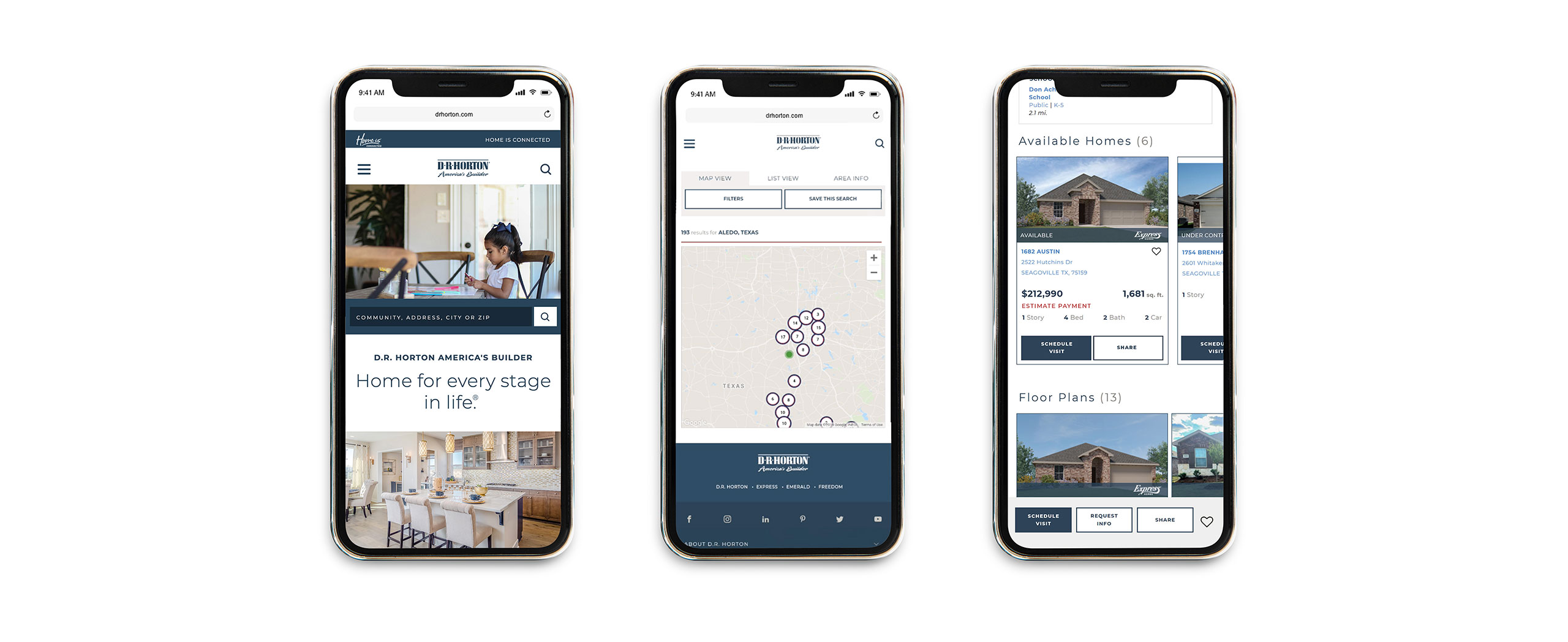
Before being brought onto the project, the website had just received a major redesign. The goal for the redesign was to improve and update the site’s overall look and feel, along with creating a user-friendly flow that could be comparable to most popular home listing sites. Unfortunately, the outsourced development team did not deliver a product that would function properly and a few key opportunities were missed during the time of the redesign. This would present itself to be the challenge.
Although the site was up and running, it proved to not be very user-friendly. Once landing on the site, you could see that there were several immediate pain points throughout. Considering that a majority of D.R. Horton’s traffic was from mobile devices, there was a major push to improve the mobile experience for the users right away. Since the site was already delayed due to fixes, the stakeholders needed an immediate solution but within a very limited budget.
While staying within the constraints that the stakeholders set and delivering on the business needs, the challenge would be to enhance the current experience and create solutions that feel natural to home buyers on their search.
- Redesign Issues: The recent major website redesign, handled by an outsourced development team, resulted in a product with poor functionality and missed key opportunities.
- Budget Constraints: Due to the previous redesign issues, we had to work within a limited budget for the necessary improvements.
- Mobile Traffic Priority: With most of D.R. Horton’s traffic coming from mobile devices, the user experience on mobile required immediate attention.
- Improved Navigation:
- Simplified the search experience, making it clear and intuitive.
- Updated the community results page with clear button callouts and a results badge.
- Enhanced User Options:
- Differentiated between floor plans and available homes with new sort and filter options.
- Streamlined User Experience:
- Replaced infinite scrolling with a “load more” option and added a map view with sort and filter features.
- Reduced scrolling by showing key information at the top of the page and organizing additional details in an accordion menu.
[ DISCOVERY & OBSERVATIONS ]
With a heuristic evaluation, I was able to initially identify several pain points that our users could possibly face such as:
- Homepage may not lead users to take action
- Search is not intuitive
- Map and search results page is exhaustive, decreasing ease
- No option to narrow down results
To eliminate any assumptions or bias, my first step during the discovery phase was to conduct 1 on 1 interviews and usability tests with users. The research participants would consist of first time home buyers and those who have previously purchased a home before. I wanted to learn more about the buyers that would would visit a DRH sales office and their habits when it comes to searching for homes online. The investigation would take a human-centered approach to understanding the constraints and considerations that may take place when a user is searching for a home on mobile and even desktop.
To start my interviews, I would conduct a survey to quickly gather information and to qualify participants at various sales and model home locations.
- Are you currently or actively searching in the market for a new home?
- Are you searching the market as a first-time home buyer?
- What are the top 3 sites you visit for new home listings?
Once the participants answered all the questions from the survey, I would conduct the usability test by asking the participants to complete a set of tasks on the DRH website. The test was based on the following scenarios:
- Search for a specific area and community
- Find an available home and floor plan
- Request Information and schedule a visit
The usability test was successful in helping to understand more about our users and their habits when it comes to searching for homes online but as suspected, each participant experienced several pain points. This led to some participants becoming stressed and frustrated, with a few stating that they would have just moved on to another site. Since I witnessed the frustration from the participants first hand, I could truly empathize with them. I gathered my new observations and was now ready to start on the next phase.
You can view the testing plan here.

[ Ideate & Explore ]
I like to do my sketching on our “community” whiteboards and a smaller whiteboard table I keep at my desk. Throughout the process I fill the boards with notes, ideas, and iterations. It’s near by so my team or other teams, such as marketing or the graphic design team, have the option to review, add notes, input or even feedback. This is great for our quick ideation sessions.
[ Iterations ]
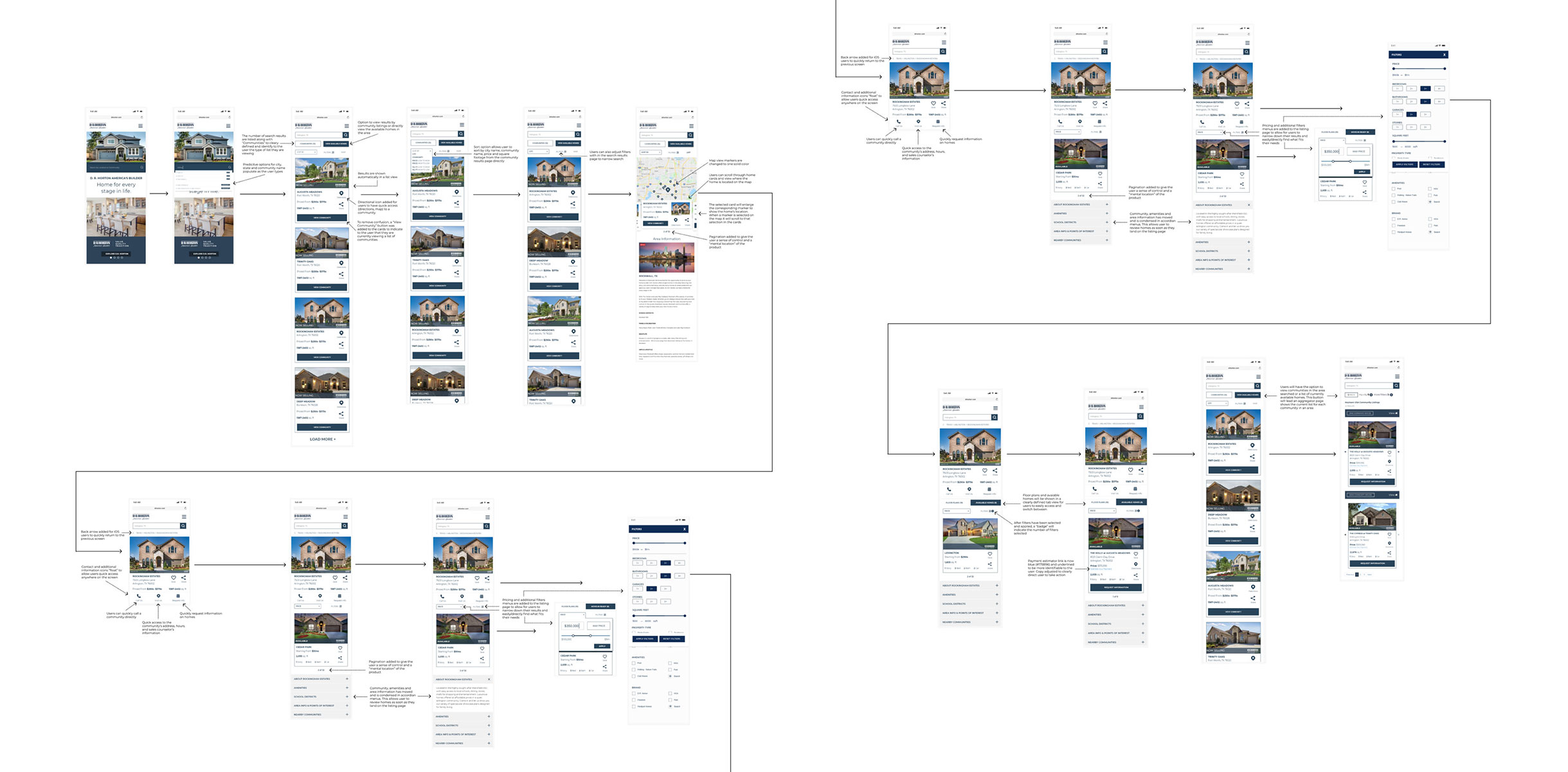
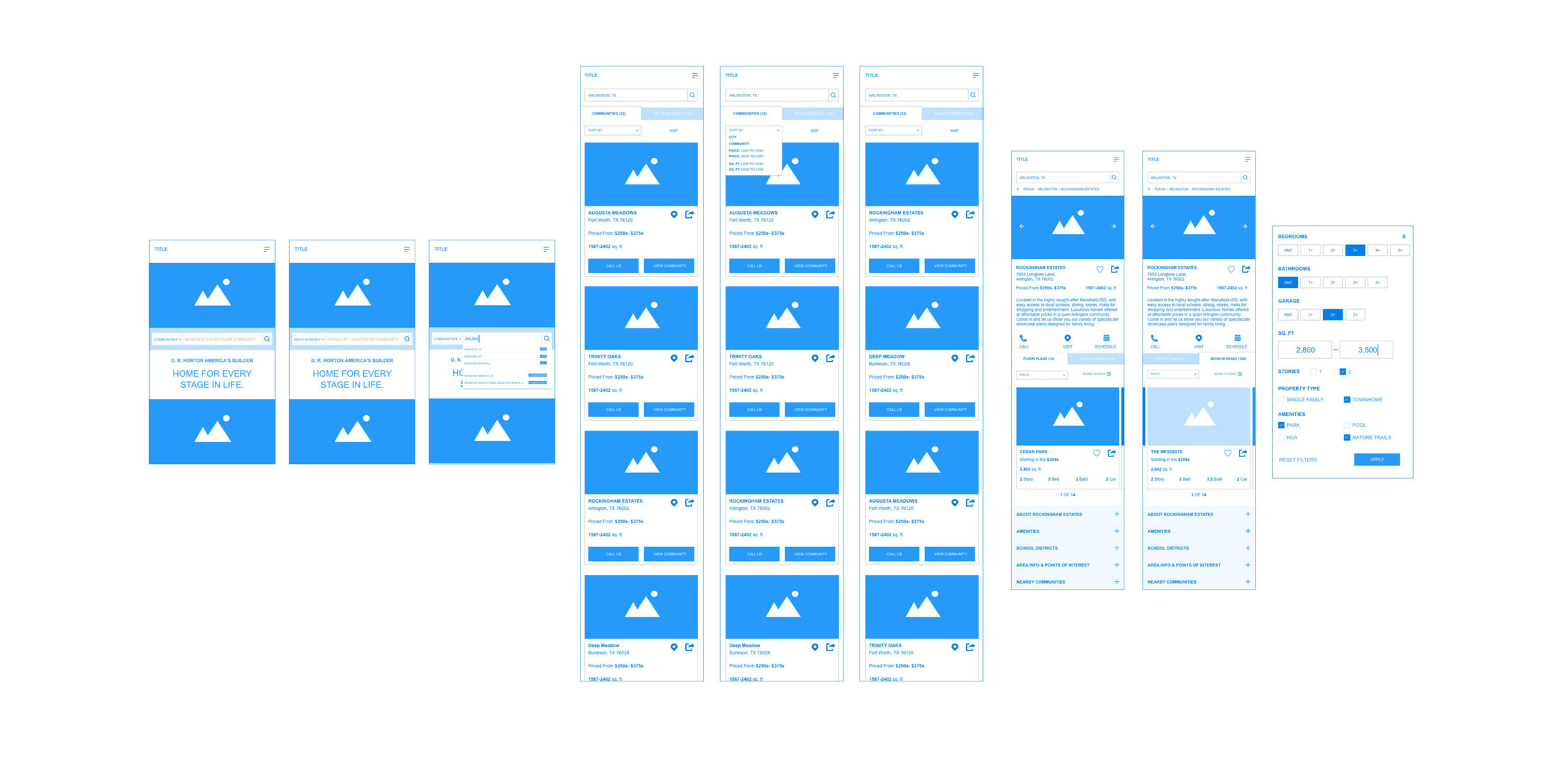
After countless explorations and iterations, we decided to move forward with a direction that was simple yet gave several new options to our users.
[ Final Deliverables & Solutions ]
Communication
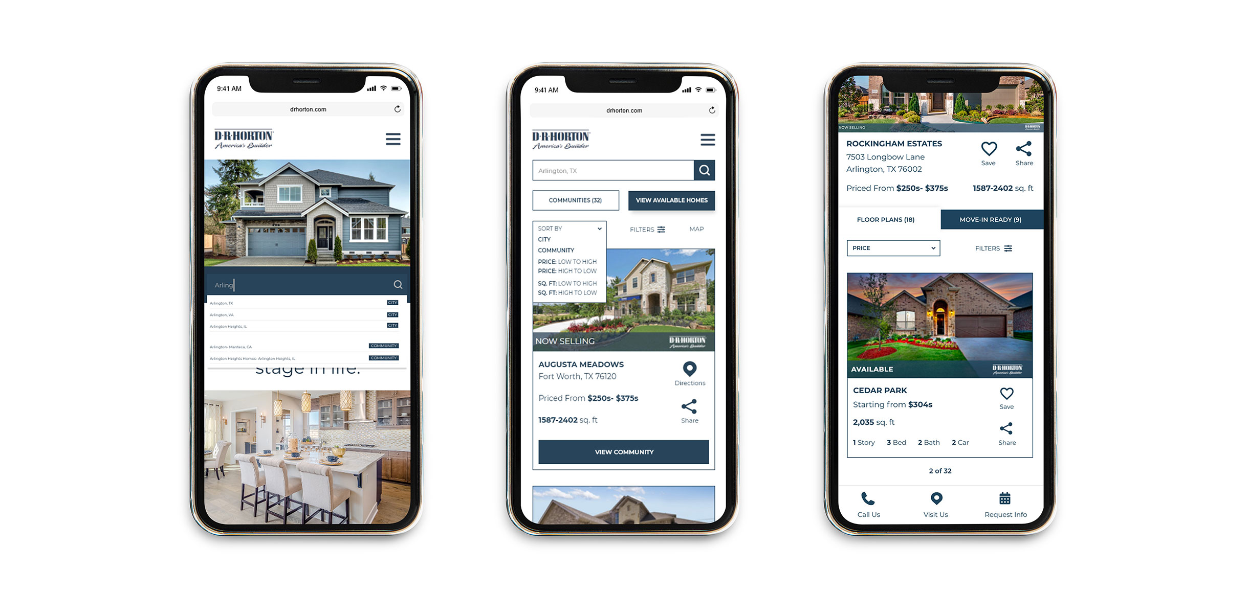
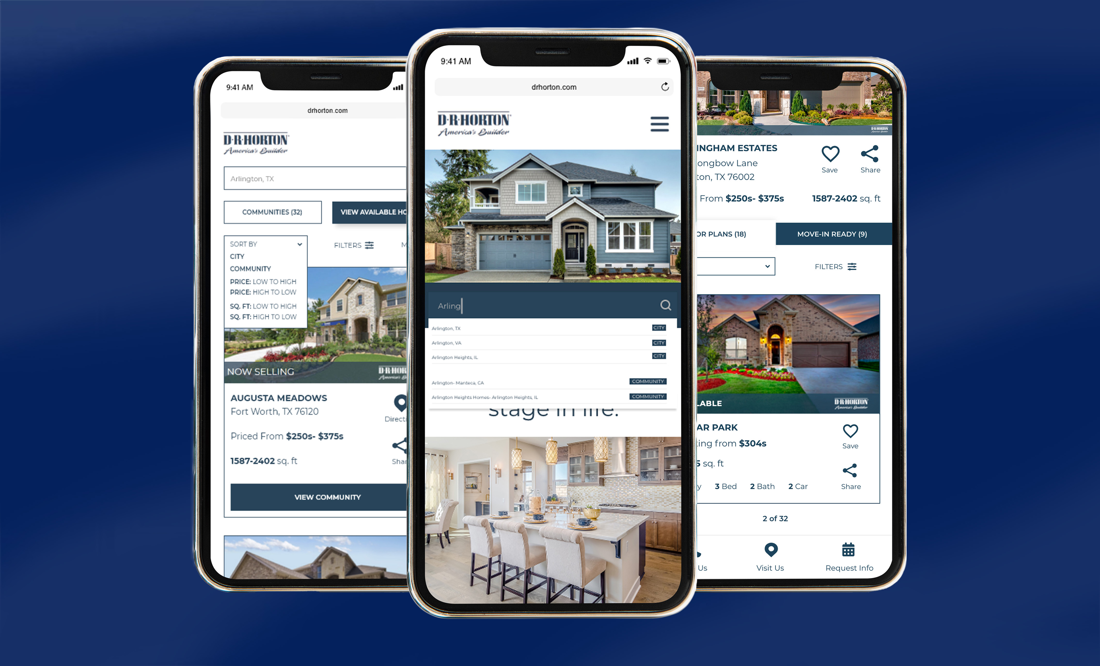
- Making our search clear, direct and intuitive
- Updating the communities results page to be clear and direct with button call outs and a number of results badge
- Creating differentiation between floor plans and available homes along with sort and filter options
Convenience
- Giving users the opportunity to go directly to what they want- find out what available homes are listed in a specific community or view all the available homes in any given area. Giving users the opportunity to explore areas they may not have initially considered
Aesthetics
- Created the map view to be familiar and markers that are easily identifiable to increase engagement
Efficiency
- Taking away the stress by switching the infinite, horizontal scroll to a “load more” option and adding a map option plus sort and filter options to the results page
- Add pagination to areas that will have a horizontal scroll
- Lessen scrolling by showing only the important information at the top of the page, giving users a direct view to the homes and floor plans. Additional information was added to an accordion menu under the listings
Involve developers early on.
This one’s probably the easiest to agree on and something others have said time and again. While I had plenty of big ideas initially, I didn’t take into account that our development team would also have their own set of limitations and constraints. Communication was key in understanding their capabilities early on. If they were to see what we were thinking about during the ideation process, we would’ve been able to eliminate some ideas early on.
Improvements to my own process.
Things may become a little scattered at times when working with other teams, but spending the time to understand their processes and even timelines helped to improve mine. Creating and improving the UX process to combine SCRUM meetings, breaking down design strategies and timelines truly helped to streamline my day-to-day work. This was one of my greatest takeaways from this project.
